

In the past, web designers had few options to position elements on a web page. Creating an effective layout was accomplished by a strategic combination of CSS positioning attributes. These attributes include static, relative, fixed, and absolute.
By default, HTML elements are positioned as static. Static items occupy space on the page, are pushed down the page by objects occurring earlier in the document, and in turn, push subsequent objects further down the page if they occur afterward. The vast majority of elements appearing on a given web page are statically positioned. If nothing has been explicitly defined, a given element is assumed to be statically positioned.
Elements can also be relatively positioned. These elements appear on the page relative to where they would normally appear in the flow of the document. Like statically positioned elements, relatively positioned elements impact the layout of the elements adjacent to them in the document. The key difference from statically positioned elements is that a relatively positioned element can be moved from its default location using CSS top, bottom, left, and right attributes. Applying these attributes has the effect of adjusting the location of an object, however, the space that would have been occupied by the object remains unaffected creating a visible gap in the page content. Adjacent elements will still wrap and flow around that gap as if the object still occupied that space. This behavior can be useful when used properly. It can also cause a lot of frustration and head-scratching when troubleshooting a layout that is doing unexpected things.
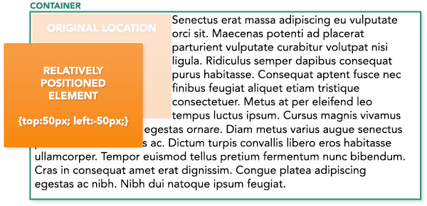
In the above example, note how the relatively positioned element is being pushed down 50 pixels from the top of the container. it is also being pulled to the left 50 pixels (using a negative value), resulting in it breaking outside of the container. Also note that the text content flows around the element as if it continues to occupy the original space, even flowing beneath the relatively positioned element and being partially hidden by it.
Modern web sites often have headers, navigation, and other elements that remain fixed in a given location, even as the page scrolls. These fixed elements behave differently in that they do not occupy space on the page. They are not affected by elements occurring earlier in the document, and they do not affect the layout of elements appearing afterward. The result is that the fixed element appears to sort of hover above the other elements on the page. This can be useful for interactive interface elements that need to be accessible at all times. Fixed elements are positioned using CSS attributes such as left, right, top, and bottom. These attributes are always applied in relation to the web browser’s viewport, or in other words, the window displaying the web page. This is true regardless of where the code for the element is found in the HTML source of the page.
Like fixed elements, absolutely positioned elements do not affect elements adjacent to them. They occupy no space on the page, and leave no gap in the content when moved to a new location via CSS. They are also positioned using top, bottom, left, and right attributes, however, unlike fixed elements, the location of absolutely positioned elements is determined by the nearest positioned ancestor. (a positioned element is an element using any positioning attribute other than static) For example, an element can be absolutely positioned inside a containing DIV tag, provided that the parent DIV has a position attribute of relative. This behavior makes absolute positioning highly flexible, and is therefore useful in a wide variety of layout applications.
A sticky situation
The relative newcomer to the positioning game is sticky. Sticky positioning has been a viable option since about 2016, and modern browser support is surprisingly robust. However, the technique remains underutilized since some web designers are not aware of it. That’s too bad, because it has the potential to be extremely useful!
Sticky positioning combines the best aspects of fixed and absolute positioning. An element positioned with sticky will remain at a fixed location on screen even as the user scrolls the page. However, unlike elements with fixed positioning, the element can be relative to its immediate containing ancestor. This is where the true magic happens! This means the element can potentially come into view as the user scrolls the page, remain fixed at a given location while the user continues to scroll, and then scroll out of view at a point further down the page. For example, imagine a scenario where the layout calls for a sidebar featuring a sign-up form, related links, or other important interactive element. With sticky positioning, those elements can scroll with the page until they reach the top of the page, at which point they will “stick” and remain visible as the page continues to scroll upward out of view. This will remain true until the bottom of the containing element (the sidebar in our case) scrolls to a point where it can no longer contain the child elements and keep them visible on screen. At that point, the sticky elements will then continue to scroll upwards off screen. It is a great way to emphasize important elements of a page and keep them visible as long as possible. Similar results could be achieved with some javascript, but using sticky positioning creates the behavior using pure CSS.
It is very important to understand that immediately upon defining an element as sticky, the parent element is automatically defined as a sticky container. The sticky container has some unique properties to be aware of. Primarily, the container defines the scope of how the sticky object will behave. A sticky element can only stick inside of its container, and it can only float above elements also contained in that same container, i.e., siblings of the sticky element.
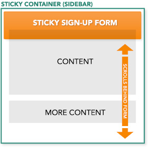
Consider the above scenario where the sidebar is our sticky container. If the sidebar only contains the sign-up form, and that element is defined as sticky, it will not work. This is because the sidebar container will essentially collapse to only be large enough to contain the form. The form then has no vertical room to slide, so it immediately scrolls with the page as if it were positioned statically. However, in that same scenario, if additional elements were added to the sidebar, the form would then begin to stick and allow the sibling elements to scroll behind it. Another solution would be to explicitly define the height of the sidebar so that it is greater than the height of the form.
A sticky example
In the above example, note that we wanted both the form and the related links list to be sticky, so we wrapped both elements in an additional sticky DIV, which automatically defines the sidebar DIV as a sticky container. The result is that all contents of the sidebar behave as a single sticky element. The sidebar displays at 100% height as a result of it being a flexbox column element, so our sticky element is free to slide as the page scrolls. Note that it is not advisable to assign the sticky attribute to multiple elements in the same sticky container. The elements will clash as they each try to claim the same page location and unexpected (and unpleasant) results will occur.
As stated above, browser support is surprisingly good. Only good ol’ reliable Internet Explorer has a serious problem with it.
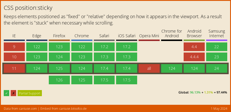
However, the great thing is, sticky positioning fails gracefully. If the browser doesn’t support it, the element simply behaves like a normal statically positioned element and scrolls with the page as the user would expect. At the time of this writing, to get Safari support you must use the webkit prefix in addition to the regular CSS property:
position: -webkit-sticky; /* Safari */
position: sticky;
The potential uses for sticky positioning are as exciting as they are endless. When combined with long-form pages that include parallax effects or other scroll-based events, I can see the potential for some very powerful and interesting layouts especially with respect to interactivity. I look forward to spotting some good examples in the wild.